Author

Stéphanie Dorval
As a UX designer at EDL, Stéphanie designs complex user journeys, audits existing experiences, and helps software companies improve user happiness.
Creating a consistent experience across different devices and platforms is no easy feat! Many factors need to be considered: screen sizes, user expectations, and varying interaction models. But don’t worry, we’ve got you covered.
In this edition of Digital Design Insights, we will explore techniques and strategies to achieve seamless connections between devices, enhance usability, and maintain brand integrity. We’ll cover topics like responsive design, adaptive layouts, and design systems for scalability. We’ll also emphasise the importance of user feedback and iterative refinement in fine-tuning these designs, ensuring they meet user needs across the digital spectrum.
By the time you finish reading this article, you’ll have gained insights into practical approaches that can empower you to navigate the challenges and complexities of the modern multi-device landscape. We aim to help you create experiences that captivate and engage users regardless of their device.
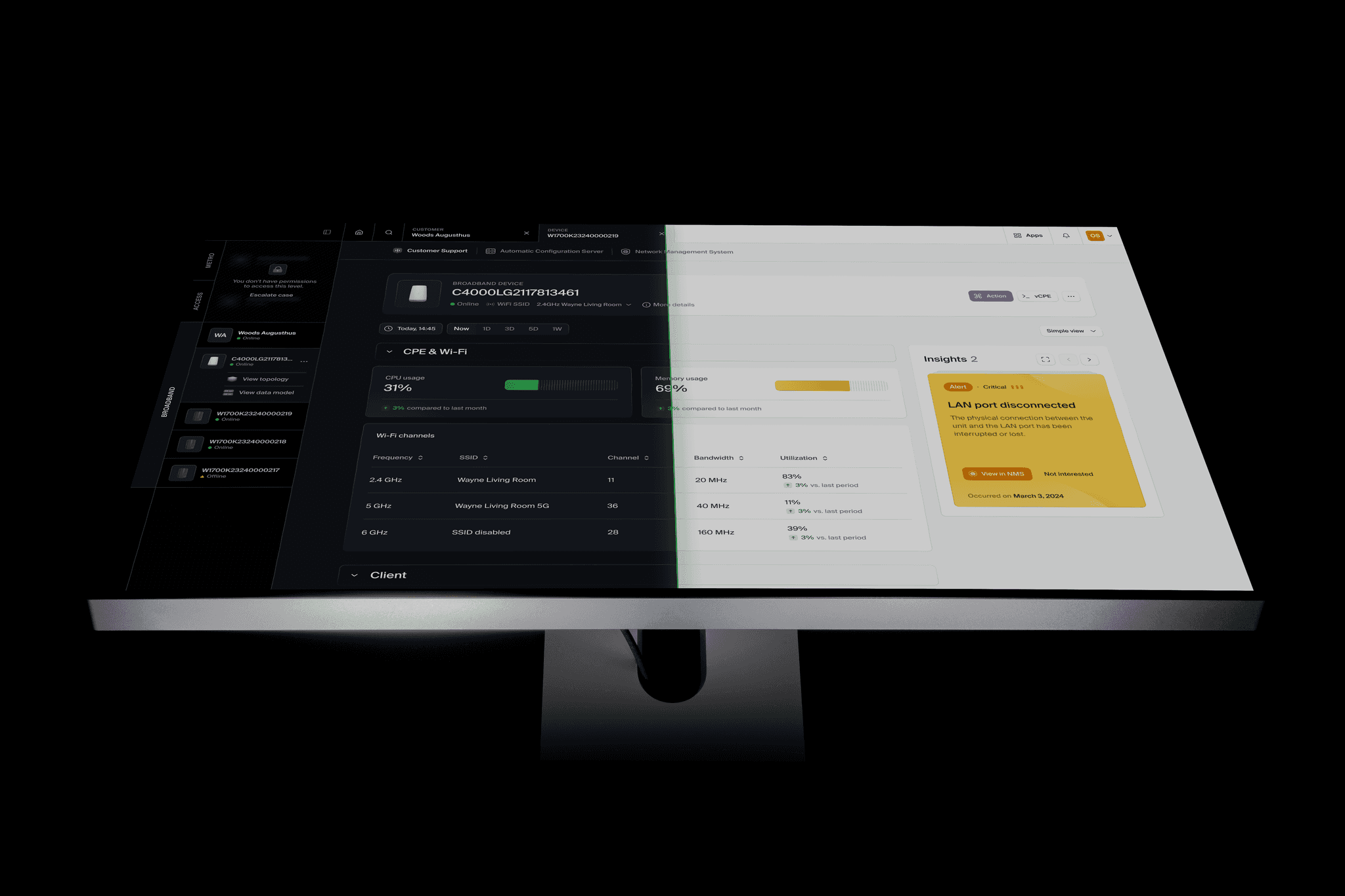
The Jublo platform accessed on both desktop and mobile devices.
Let’s start with establishing a unified design language
o achieve multi-platform consistency, we must establish a unified design language as a foundation for all platform-specific designs. This language includes visual elements such as colours, typography, icons, and layout principles. By defining these elements in a style guide or design system, we create a shared vocabulary that can be applied consistently across platforms.The design language should reflect the brand’s identity while considering the unique characteristics of each platform. For example, while maintaining brand colours is crucial, adapting them slightly to suit the aesthetics of each forum can enhance the overall user experience. The challenge lies in finding the balance between brand identity and platform-specific usability.
Responsive design and adaptive layouts
Having a website or app that works well on all kinds of devices is essential. That’s where responsive design comes in! It means ensuring that everything on the screen looks great no matter what size or how it’s held. This keeps things easy to use and navigate through no matter what device people use.
But it’s not just about making everything fit on the screen. We must also consider how people use the website or app on different devices. For example, on a computer, we have multiple columns of information, but on a phone, it is better to have everything in one column so people can scroll up and down easily. By ensuring everything is consistent and easy to use across all devices, we can help people switch between them without problems.
Prioritising content, functionality, touchpoints, and interactions
It’s important to remember what users need when making content and functionality for different platforms. A desktop app may have many features, but when creating a mobile app, it’s best to focus on the most important tasks so users don’t get overwhelmed. Utilising progressive disclosure, everyone can access what they need without any unnecessary fuss.
Another thing to keep in mind is how people interact with different devices. Phones and computers have unique ways of doing things, like touching or clicking. So, we should adjust these interactions for each platform while still keeping them user-friendly. For instance, a swipe gesture could be changed to a drag-and-drop action for desktop users. These tweaks help everyone have a great experience, no matter their device.
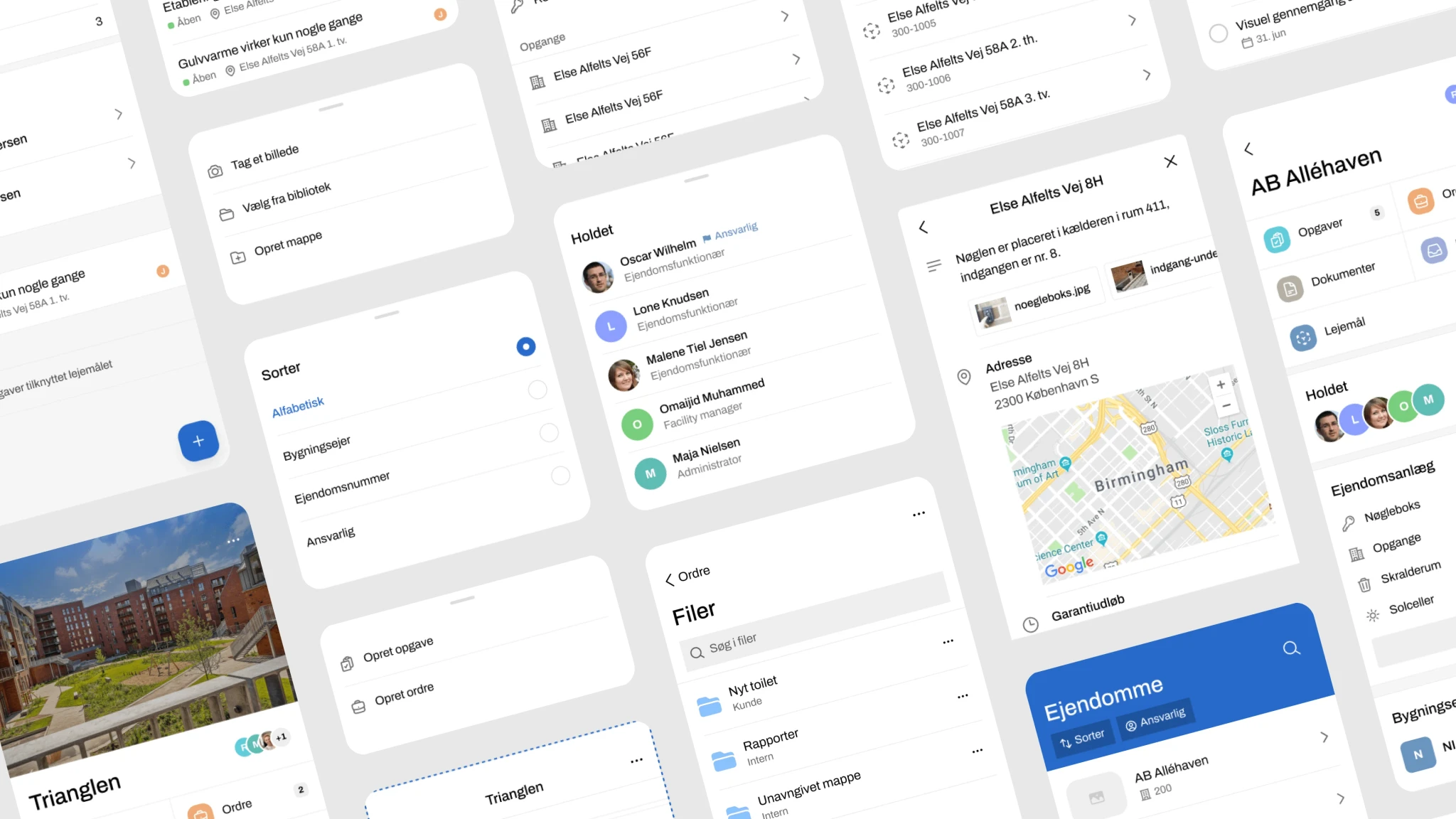
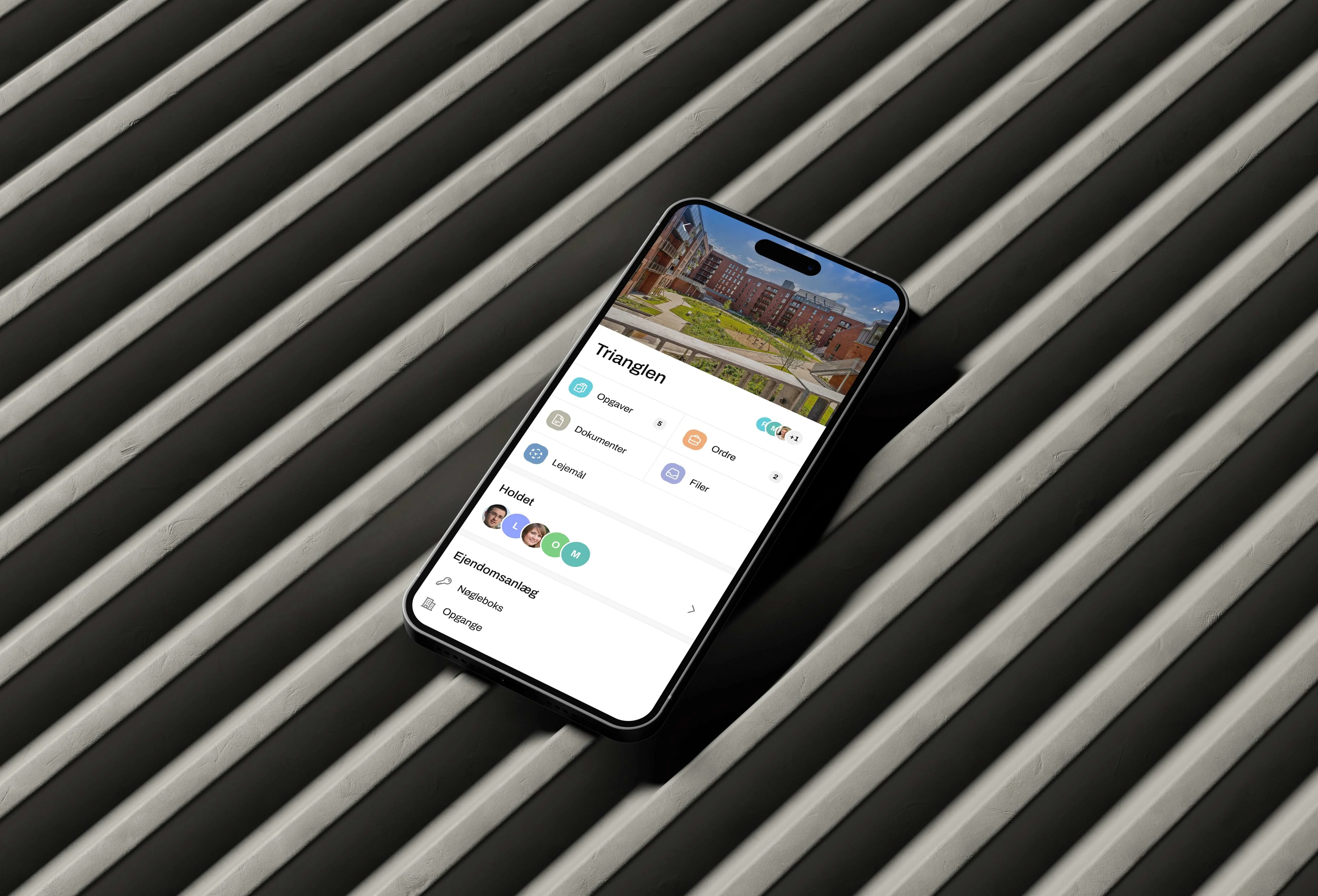
An overview of features designed specifically for the mobile experience of Jublo.
Leveraging design systems for scalability
If you’re looking for a way to keep your designs consistent across different platforms, consider using a design system. This set of reusable components, guidelines, and design principles reflect your brand’s identity and user experience. With a design system in place, you’ll be able to create designs that look and feel the same across all your platforms, which saves you time and effort.
The great thing about design systems is that they provide a central repository of design elements like buttons, forms, navigation patterns, and typography styles. These components are carefully crafted to match your design language and can be easily adapted to different platforms without losing consistency. And if you need to make changes in the future, you can do so while still maintaining your brand’s core identity.
Another advantage of design systems is that they encourage collaboration among cross-functional teams, including designers, developers, and product managers. By using a shared set of design principles and assets, everyone can work together seamlessly and avoid inconsistencies arising from different design approaches.
So why not use a design system for your next project?
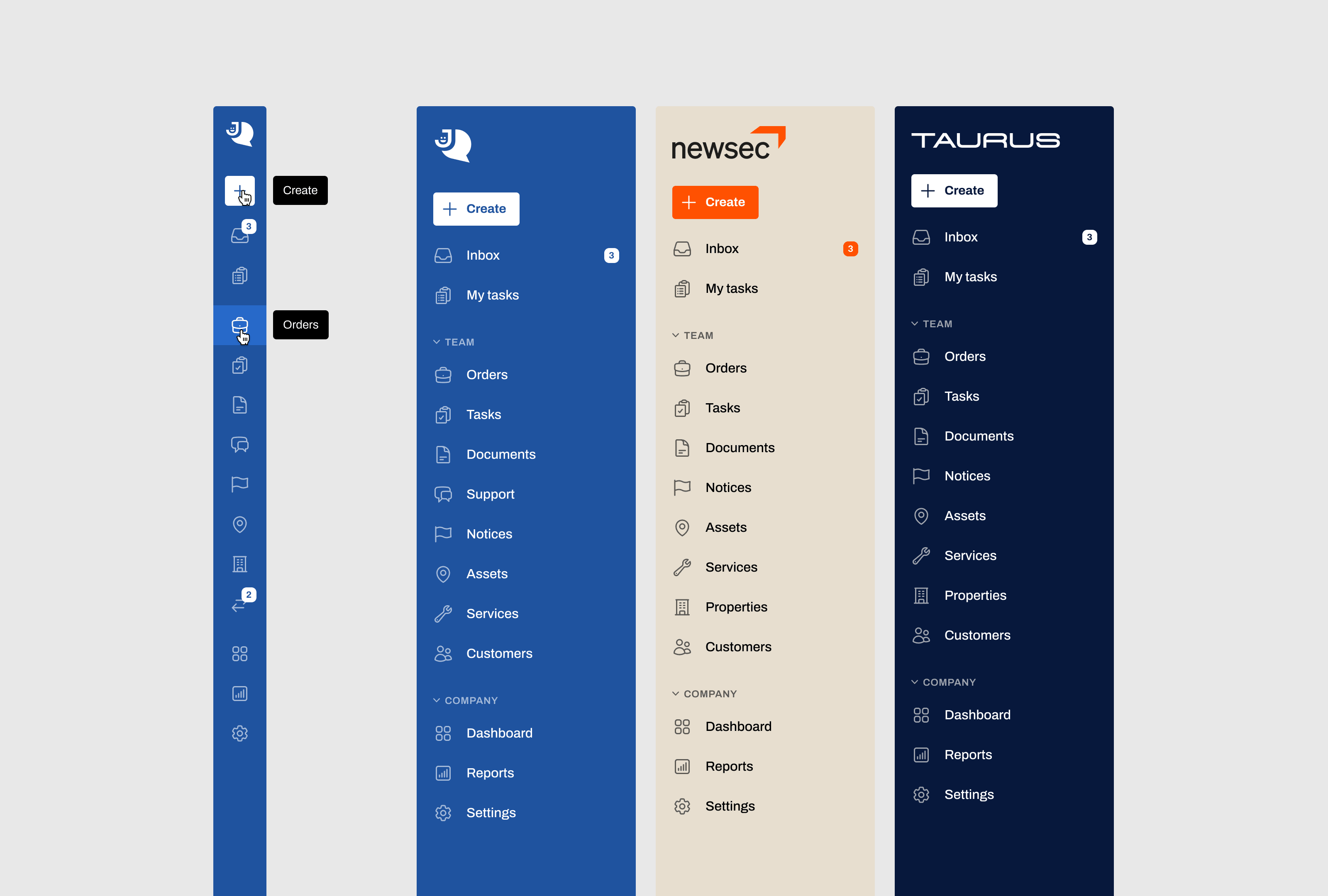
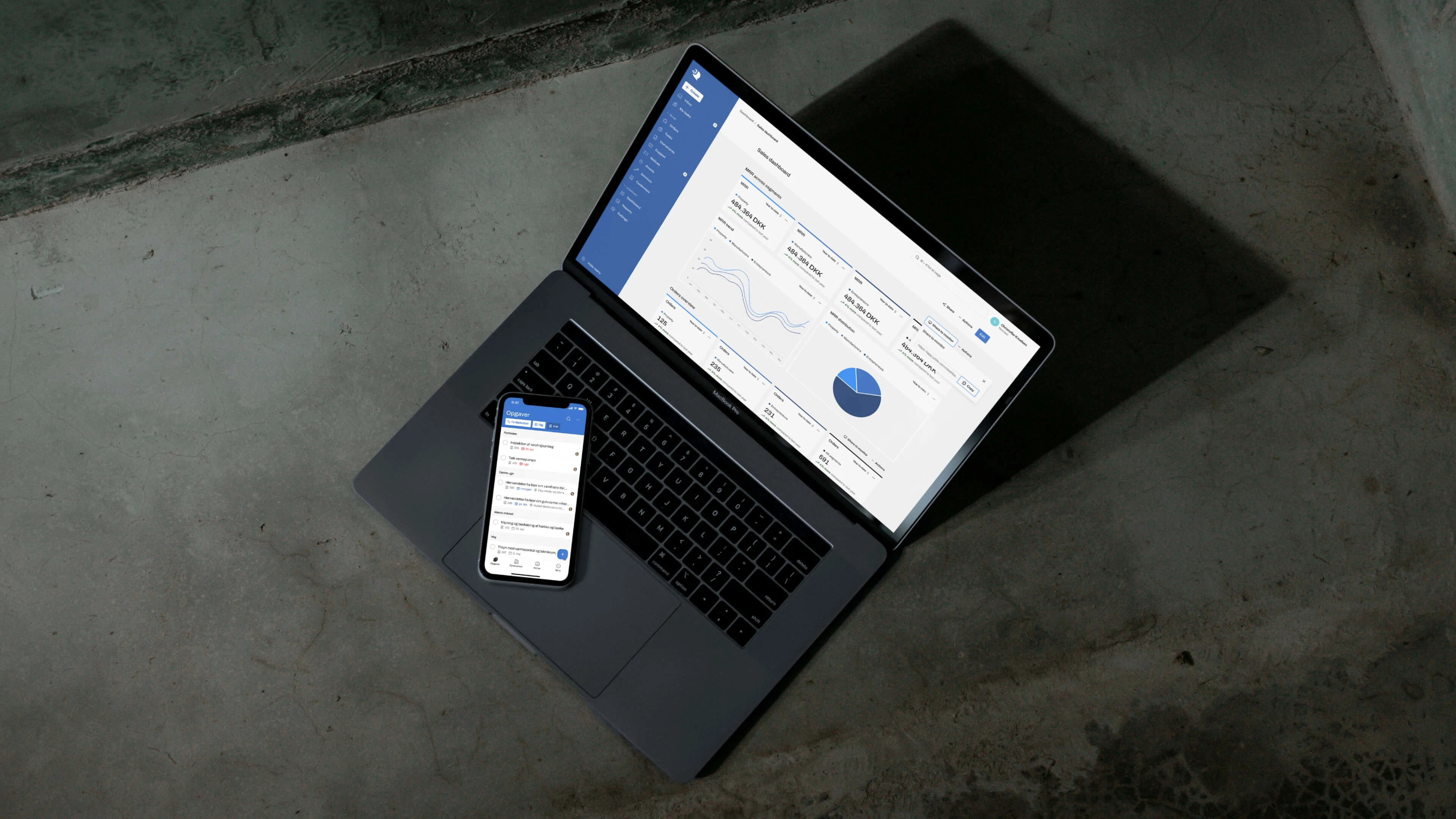
Jublo’s new navigation is designed for high accessibility, efficient multitasking, and interchangeable branding.
User feedback and iteration: The key to “good” design
Were you curious about how to judge whether your design works? Well, here’s the key: to consistently gather feedback from users. By conducting regular usability tests on different devices, we can pinpoint problem areas and inconsistencies in their designs. The feedback you will receive from users who switch between platforms is particularly valuable because it helps us determine how effective the design language is and how well it’s working for users.
But that’s not all. Iterative design is a crucial part of the process. We can gradually improve the overall experience and create a more cohesive design across platforms by continuously refining and optimising the design based on real-world usage and user feedback. It’s a never-ending cycle of improvement that ensures users always get the best possible experience.
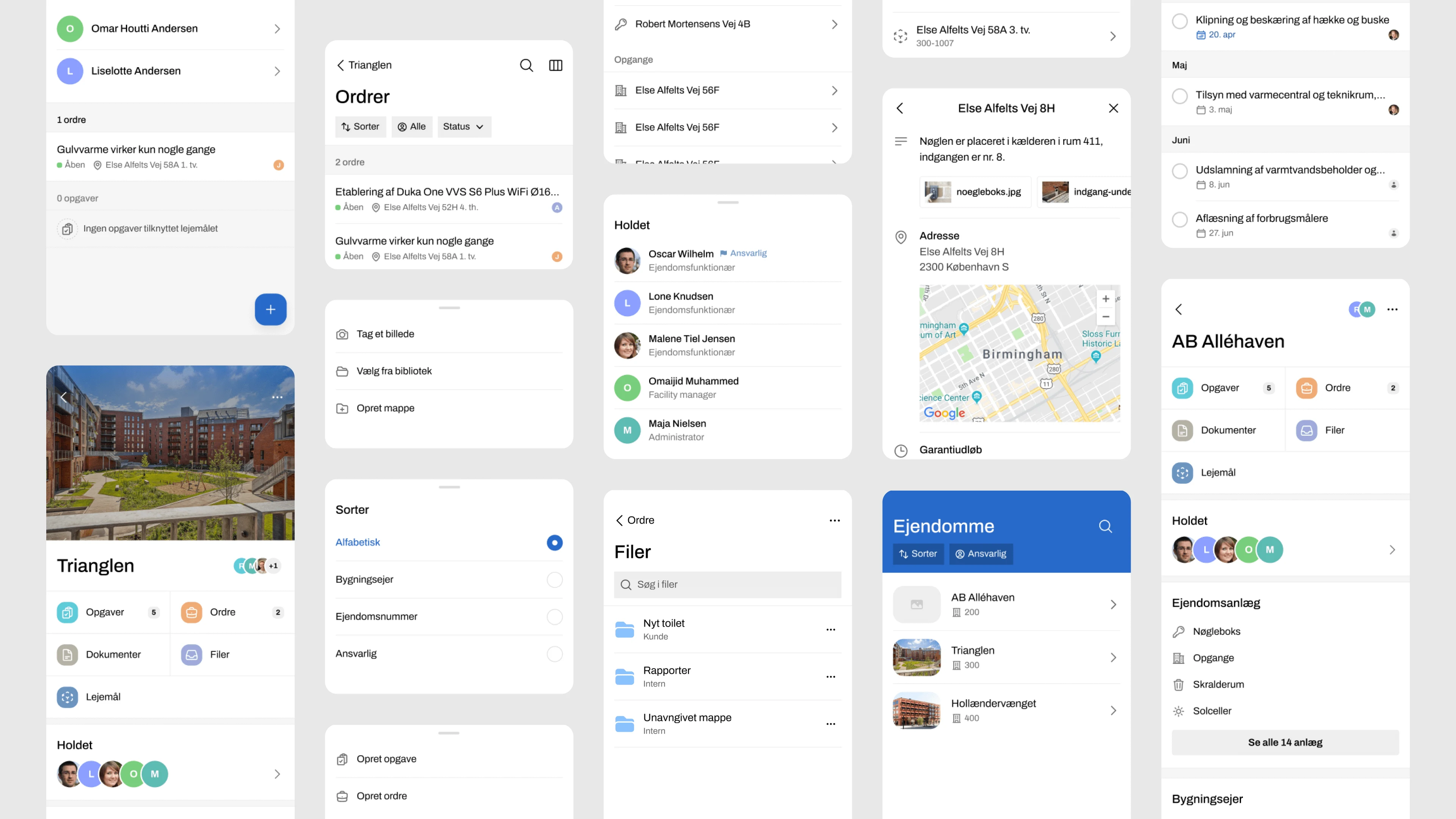
By prototyping the mobile app experience, we could conduct usability tests that informed the final design.
Let’s wrap up everything we’ve talked about
It takes a lot of effort and expertise to establish a shared design language that can adapt to different screen sizes, prioritise the right features and content, and optimise touchpoints and interactions.
It’s all about making it easy for users to interact with brands and content, no matter where they are. By paying attention to even the smallest details, understanding what users want, and staying true to a brand's identity, we can overcome the challenges of cross-platform design and deliver experiences that truly resonate with users across all devices and platforms.