

When most people think about branding a digital product, they think about a logo in the top left corner of a side panel. Maybe a colour palette. However, those are just the obvious parts, the surface-level visuals that users notice first.
The truth is, a logo is only a tiny fraction of what makes your product feel like your brand.
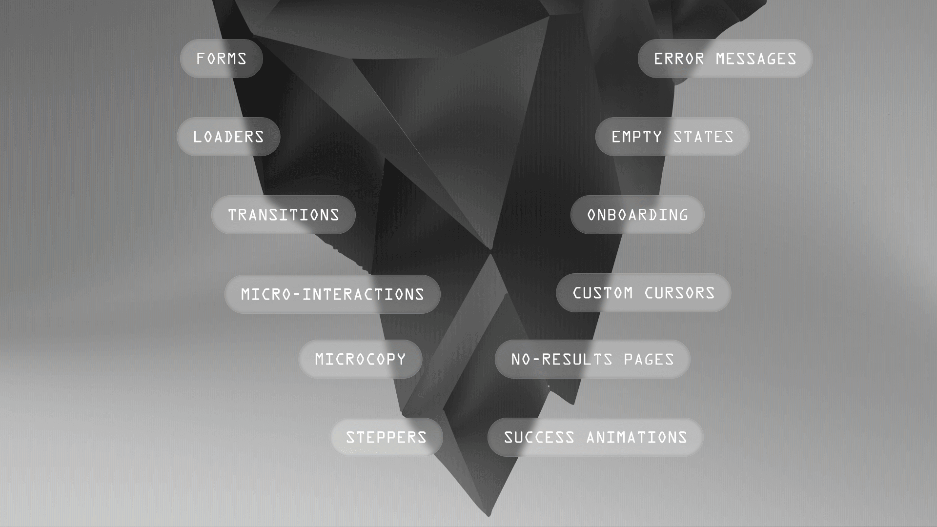
The most successful digital products build their brand in the places most teams forget to look, in the empty states, the onboarding flows, the error messages, and the subtle design choices that quietly reinforce identity without ever getting in the user’s way.
Branding doesn’t need to be loud to be effective. The strongest branding often resides in the quiet moments of UX, in micro-interactions, in the behaviour of a progress bar, in the voice of a tooltip, or in the illustration that welcomes a user back. These are the places where your product can stand out, feel unmistakably yours, and forge lasting emotional connections.
In this article, we’ll explore practical, low-friction ways to brand your digital product beyond its logo successfully. You’ll learn where to apply brand elements like illustrations, typography, colour, and micro-copy, in spaces that matter but rarely get branded.
If you want your product to feel cohesive, memorable, and alive with brand identity, these are the details that make all the difference.
Design below the surface
The strongest branding doesn’t come from big, flashy moments—it comes from the small, quiet spaces where most teams default to generic design.
When you intentionally design these micro-touchpoints, your brand becomes part of the experience in ways that feel natural, not forced.
Here’s where you can bring your brand to life without ever disrupting the user journey:
First impressions that stick
Onboarding screens: Branded illustrations, conversational tone, and playful transitions can immediately pull users into your brand world.
Forms and input fields: Use on-brand placeholder text, button microcopy, and branded error feedback to add personality where users least expect it.
Empty states and no-result pages: These often-neglected spaces are ideal for branded visuals, helpful messages, and humour that humanise your product.
Design the wait
Loaders and skeleton screens: Replace generic spinners with branded animations, playful loading text, or illustrated skeleton screens that carry your brand tone.
Progress bars and steppers: Use branded colours, shapes, and subtle motion to make progress indicators feel alive with your brand’s rhythm.
Success animations and confirmations: Branded checkmarks, gentle motion, or celebratory visuals can make task completion feel uniquely yours.
Voice at the edges
Tooltips, helper text, and system alerts: Branded microcopy can bring warmth and clarity to functional spaces without disrupting flow.
Push notifications and in-app messages: These are perfect places to use your brand’s tone, emoji style, or pacing to make your messages instantly recognisable.
Error states: Brand voice can soften friction here—use thoughtful phrasing and brand visuals to make recovery feel human.
The overlooked essentials
Settings menus and toggles: Apply your brand’s colour palette, typography, or motion language to these often-forgotten corners.
Search bars and no-results pages: Branded placeholder text and custom ‘no results’ screens help even neutral moments feel intentional.
Support spaces: Help centres, FAQs, and chatbots can use your illustration style and brand voice to feel fully connected to the rest of the product.
Subtle sensory branding
Hover and swipe interactions: Subtle brand-led animations on hover states or swipe gestures can make the product feel distinct.
Custom cursors: Light-touch cursor styling on branded elements can create a tactile, memorable experience.
Branded sound cues: Thoughtful sound design for task completion or notifications can unobtrusively reinforce your brand.
Mobile haptic feedback: Gentle vibration or resistance on swipe gestures can carry your brand’s rhythm into touch-based interactions.

Systemise your brand
When branding is baked into your core design system, it doesn’t rely on individual designers or developers to “remember” to apply it. It’s automatic. It scales. It flows through the product without anyone having to stop and ask, “Does this feel on brand?” because it already is.
To build a brand that’s felt throughout the product, you need to systematise your identity.
Start with typography. Your brand’s primary font should lead in the most visible, high-impact areas—like headings, key calls to action, and system feedback. It shouldn’t be confined to decorative titles or landing pages. The right use of typography consistently reinforces your brand every time users scan a page, take action, or interact with system messages.
Your colour system deserves the same attention. Brand colours can’t just sit on the surface—they need to be embedded deep into your design system’s structure. When colours are built into tokens and component libraries, they naturally flow through buttons, progress bars, alerts, and confirmations, eliminating the need for teams to apply them manually. This is how you build visual consistency at scale—without adding friction to your workflow.
Illustrations are another powerful brand carrier, but they often lose their impact when treated as isolated assets. Instead, build an illustration system: a flexible, scalable style with reusable assets that can be applied across onboarding, support, feature releases, and empty states. When illustration styles are systemised, they create a familiar visual rhythm throughout the product. When they’re not, your brand starts to fragment.
Motion design is one of the most overlooked, yet most emotionally powerful, branding layers. It’s not enough to sprinkle in micro-interactions. You need to define the motion principles that govern how your product moves. Is your brand quick and playful? Calm and deliberate? Smooth or snappy? When you standardise animation speeds, easing curves, and transition behaviours, you create a product that not only looks but feels consistent. That feeling is what users remember.
Bringing your brand into the system isn’t about over-branding—it’s about building a design language that scales naturally and shows up effortlessly, without constant manual intervention.
When your brand is systemised, it becomes part of the product’s DNA. It appears everywhere, quietly, consistently, without anyone having to force it.
Three products that nail product branding
It’s easy to talk about branding in theory, but it’s far more useful to see how brands apply these principles in real products.
Here are three digital products that go beyond the logo to build distinctive, cohesive branding throughout their UX, quietly, consistently, and effectively.

Airbnb
Why it’s brilliant
We’ve all used it. We’ve all seen it. Airbnb is one of those products where the branding is so well integrated that you barely notice it. It just feels good to use. Their use of illustration, warm colour palettes, and soft micro-interactions makes every step feel calm and approachable. It’s not just about the logo on the homepage. It’s about the little moments, the onboarding that feels like a conversation, the friendly empty states, and the success screens that quietly celebrate your booking.
What makes Airbnb’s branding so effective is its delightful nature without being intrusive. The illustrations don’t slow you down, the tone doesn’t feel forced, and the transitions feel smooth and human. You get the sense that Airbnb knows exactly where branding can be integrated into the product without ever getting in the way.
Stealable idea
Use illustration and motion to make transactional spaces feel human.
Airbnb doesn’t wait until you check out to show its brand—it’s there in loaders, in confirmations, in the gentle way the interface moves.
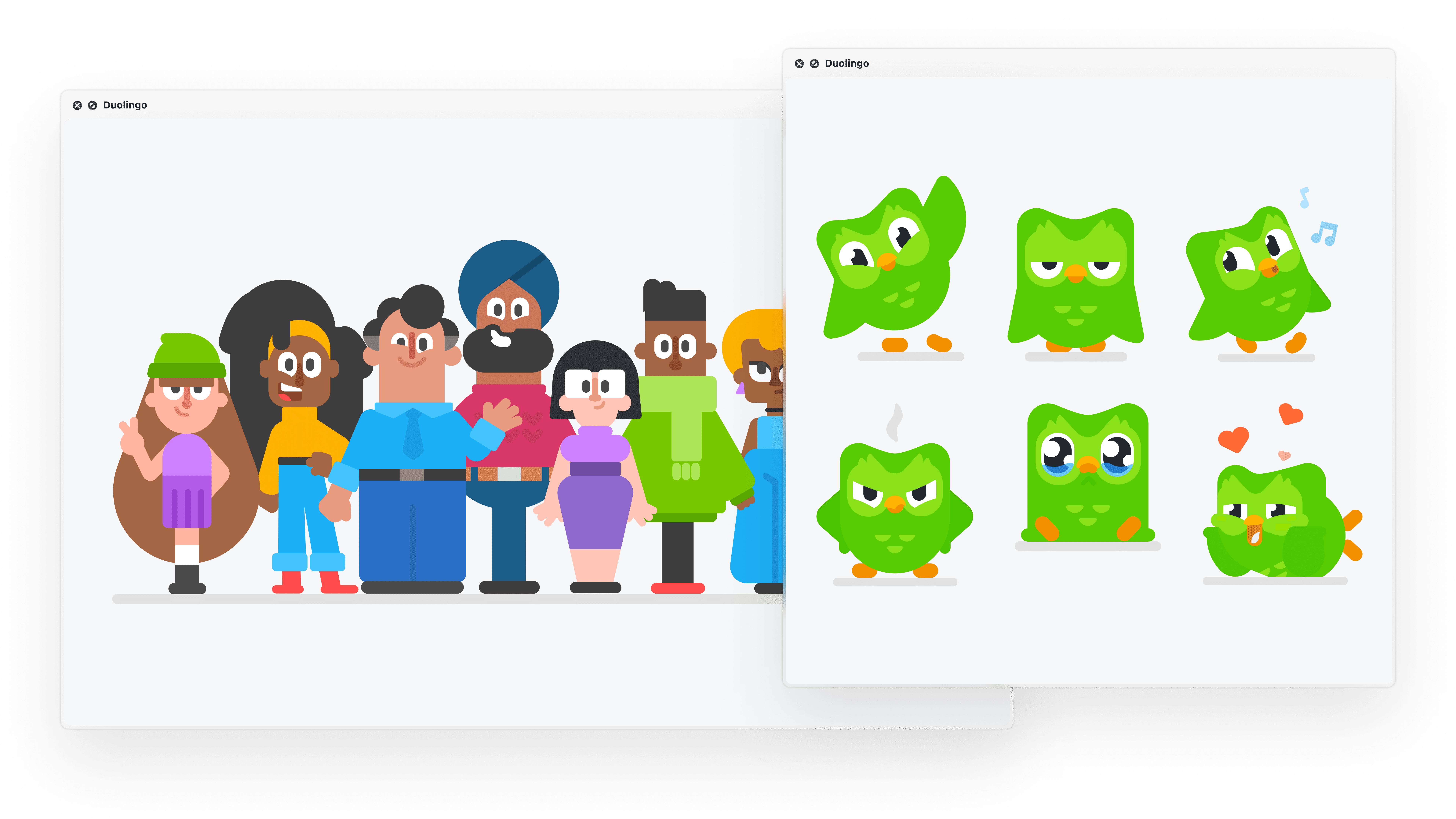
Duolingo
Why it’s brilliant
We all know the Duo owl. It’s one of the most recognisable brand mascots in digital products today, but why does it work? Because it makes the process of learning a new language feel playful, light, and low-pressure. The owl doesn’t just exist as a logo or a marketing asset, it’s baked into the product experience. Duo shows up in onboarding, progress tracking, reminders, and even in the little nudges that push you to keep going.
What makes Duolingo’s branding so effective is that it brings energy to otherwise dry, repetitive tasks. The app is filled with branded microcopy, playful animations, and reward moments that make you smile, rather than feeling like you’re being tested. The tone, visuals, and movement all work together to keep you engaged without overwhelming the interface.
Stealable idea
Use playful characters, micro-interactions, and tone to bring energy to repetitive tasks.
Duolingo isn’t just branded on the surface, it makes its brand part of the learning rhythm.
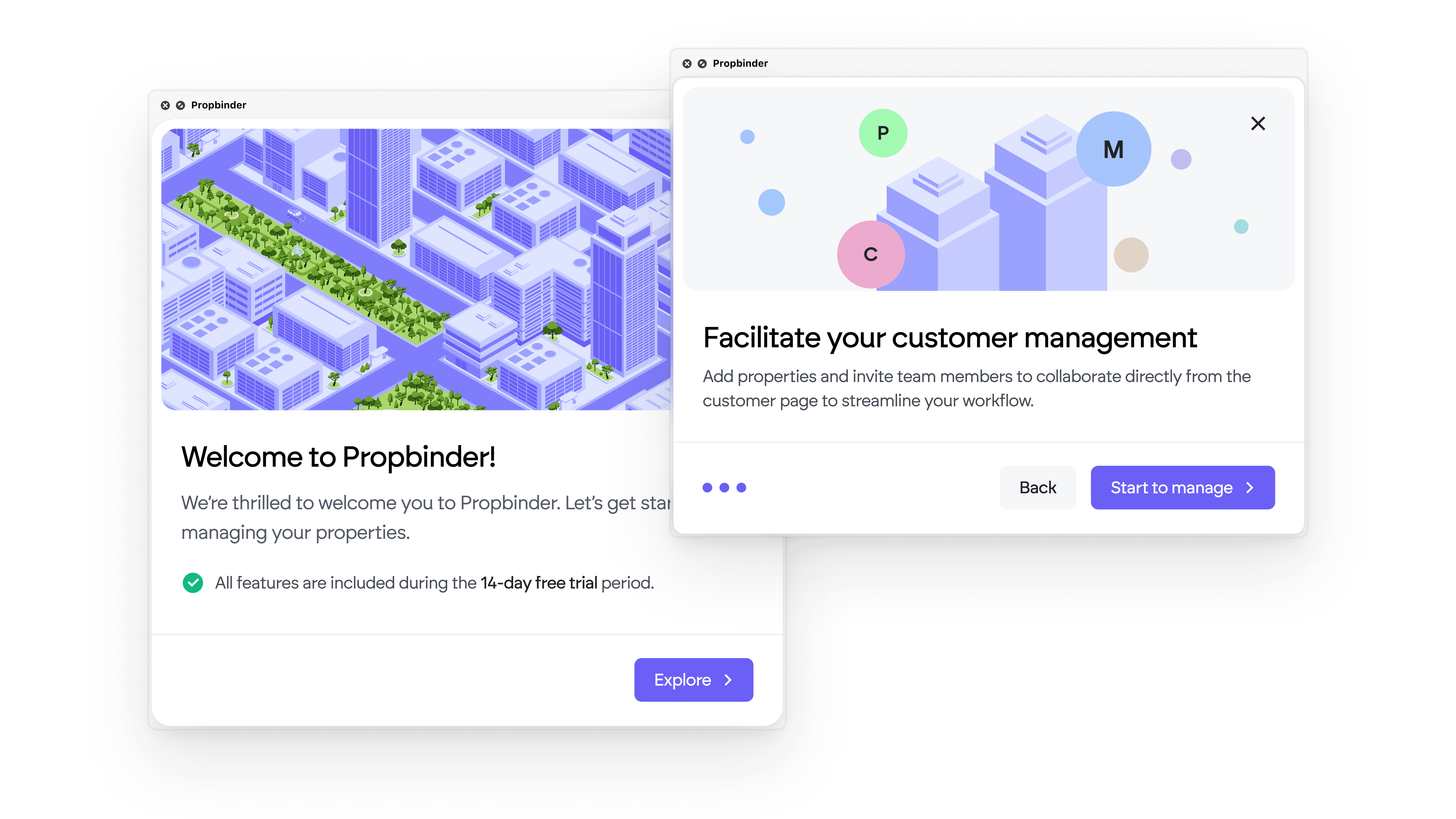
Propbinder
Why it’s brilliant
Propbinder set out to disrupt a traditionally boring PropTech space, and its branding does exactly that. By using a vibrant, energetic purple and carefully chosen hues throughout the product, we elevated a category usually dominated by sterile, corporate tones. The colour isn’t just a visual accent; it gives the entire experience a sense of modernity and momentum.
What makes Propbinder stand out is the intentional use of illustration and storytelling to communicate not just what the product does, but who the brand is. Through warm onboarding moments, branded empty states, and carefully written microcopy, Propbinder consistently feels approachable and human, even when you’re navigating technical workflows.
The branding lives in the system. Every success message, error state, and UI transition carries the same rhythm, tone, and design DNA. It’s not just a coat of paint, it’s a carefully embedded brand system that reinforces trust and usability at every step.
Stealable idea
Don’t shy away from bold colour or storytelling in traditionally “dry” spaces.
Propbinder proves that when you combine vibrant branding with intentional illustrations and systemised design, you can create a product that feels both professional and genuinely alive.
The brand lives in the details
Your logo is just the starting point. It’s the surface, the tip of the iceberg.
The real brand lives beneath, in the places most teams overlook. In the onboarding flows, error messages, loaders, and empty states. In the tone of your microcopy, the way your buttons feel when you hover, and the rhythm of your animations.
That’s where your product’s identity takes shape. That’s where your brand becomes unforgettable.
The strongest digital brands aren’t built on big moments. They’re built on small, consistent details that show up again and again, quietly reinforcing who you are. Branding lives in the system, in the behaviour, in the emotion, not just in the logo.
If you want your product to stand out, start by owning these quiet spaces. Because that’s where your brand sticks.
Oskar Siemion
Visual Design
Oskar makes things come together. He builds products that grow with you and make it easier to stay on track and deliver quality.

