
Design systems are meant to help teams move faster and stay aligned. But if accessibility isn’t part of what’s being scaled, you’re just reproducing the same issues at speed.
You start noticing buttons without focus styles, color tokens that don’t pass contrast, and components that don’t work well with screen readers. Suddenly, your system isn’t helping. It’s getting in the way. Why? Because accessibility was never part of the foundation.
Accessibility isn’t a fix, it’s a starting point
When accessibility isn’t built in, responsibility becomes scattered.
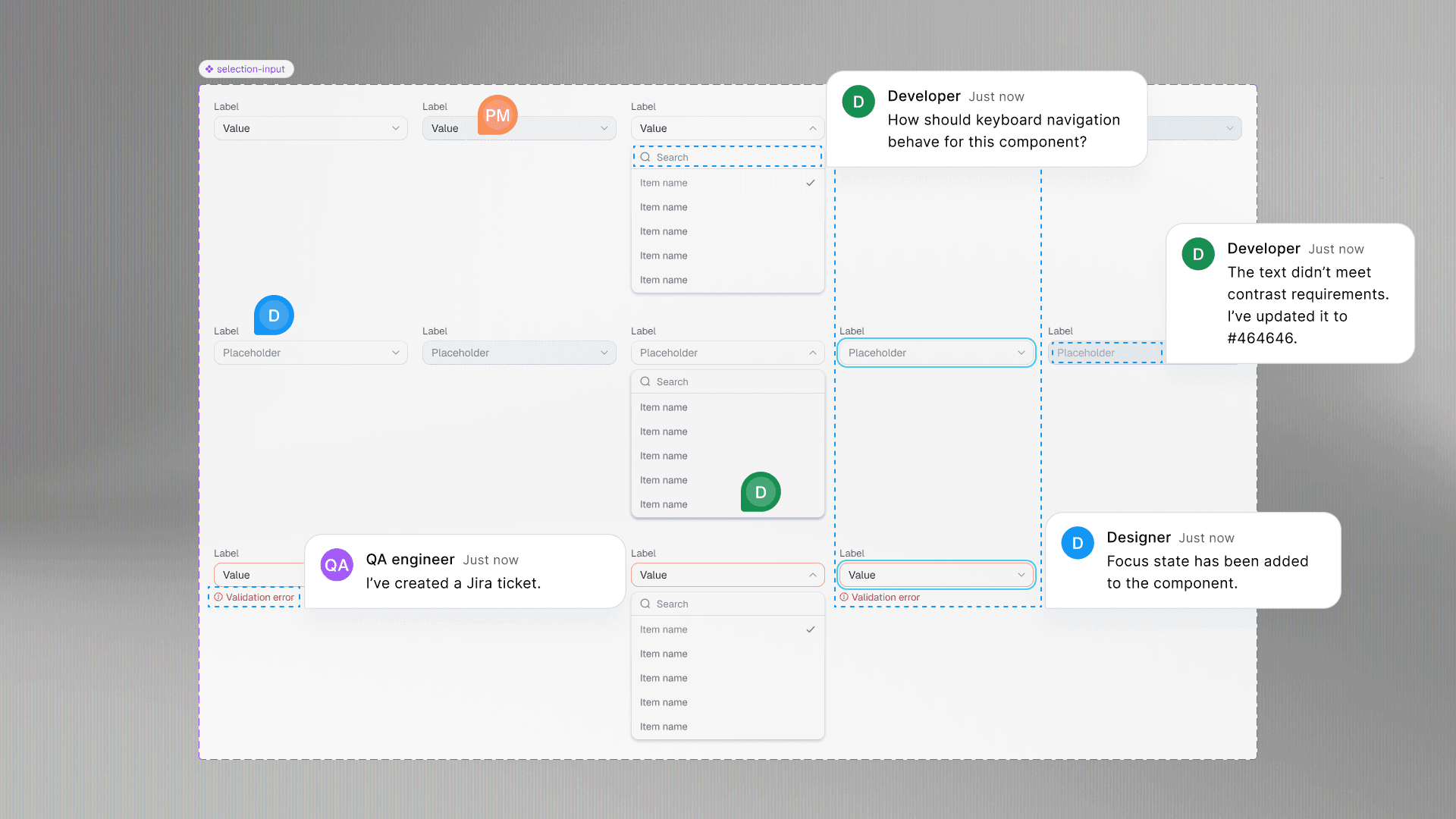
A developer adds a label here, a designer checks contrast there, someone flags issues in QA. But often it is too late or missed entirely.
This leads to inaccessible experiences shipping by default, which are costly and frustrating to fix later.
Accessibility needs to be treated like any other design standard and enforced from the beginning to avoid these problems.
Build in accessibility, not extra steps
Making your design system accessible isn’t about chasing perfection. It’s about creating components and tokens that follow best practices so teams don’t have to think twice.
Our list of best practices
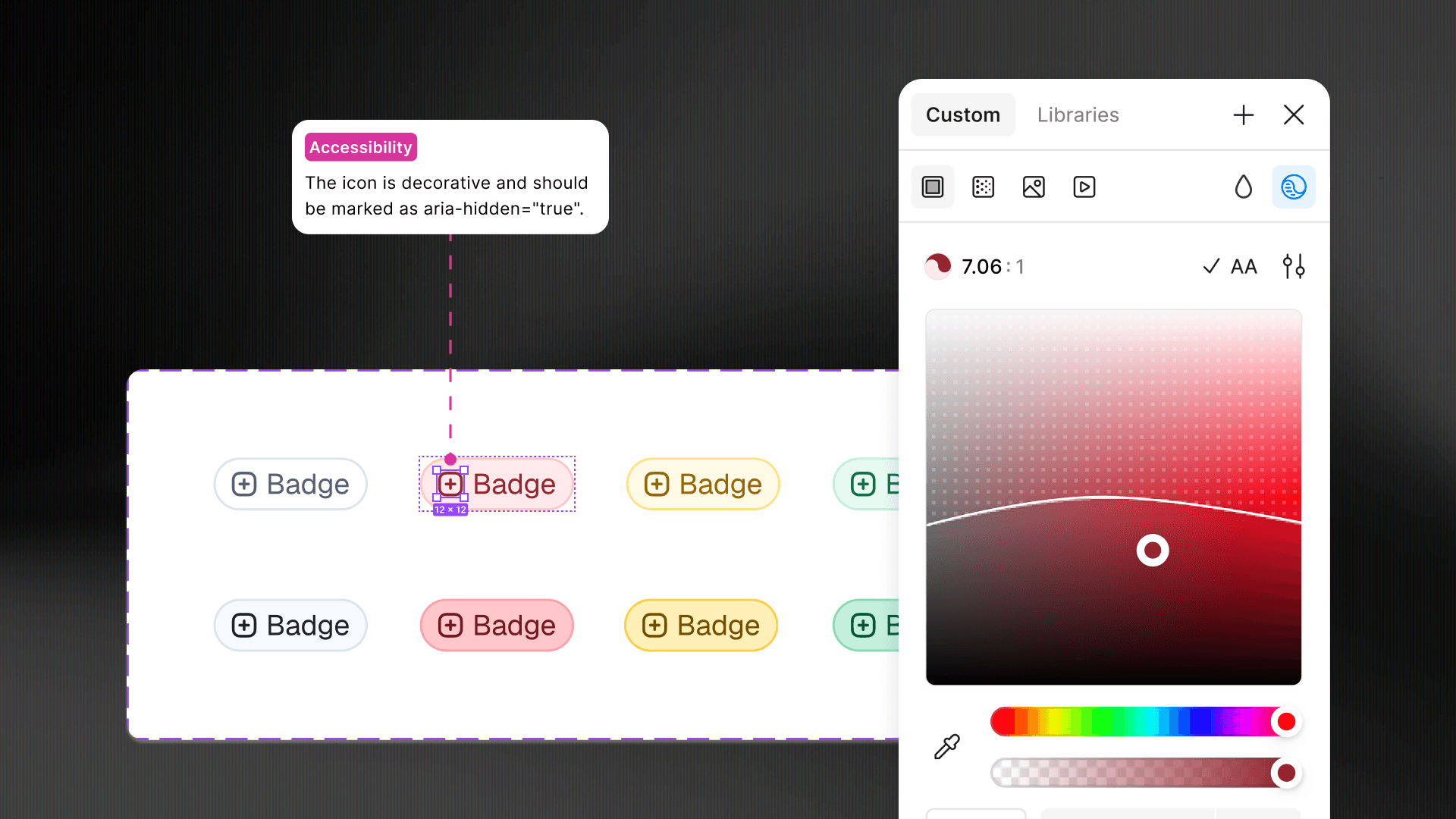
Color tokens with reliable contrast
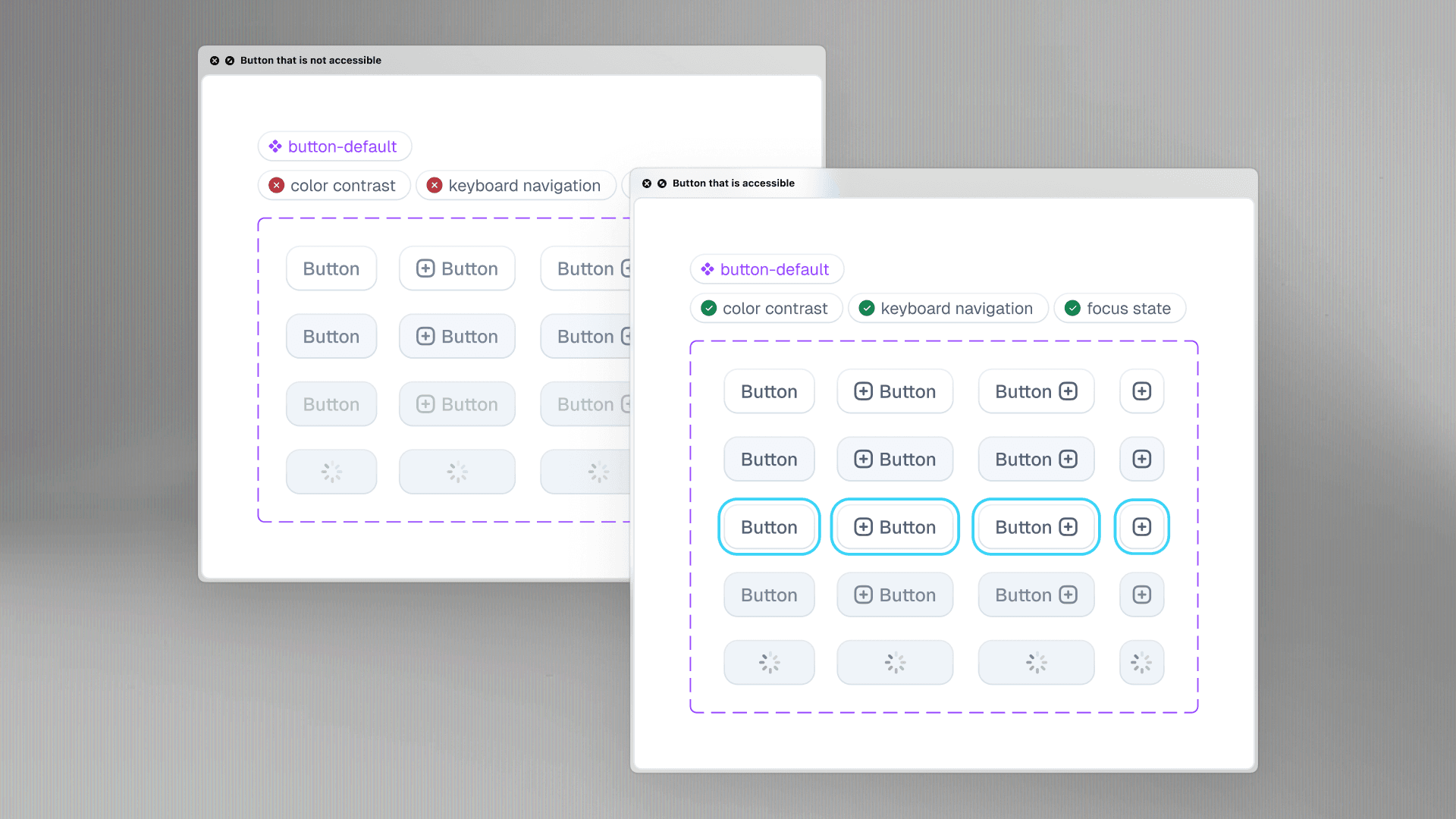
Buttons with visible focus and screen reader support
Inputs with proper labels and helpful error states
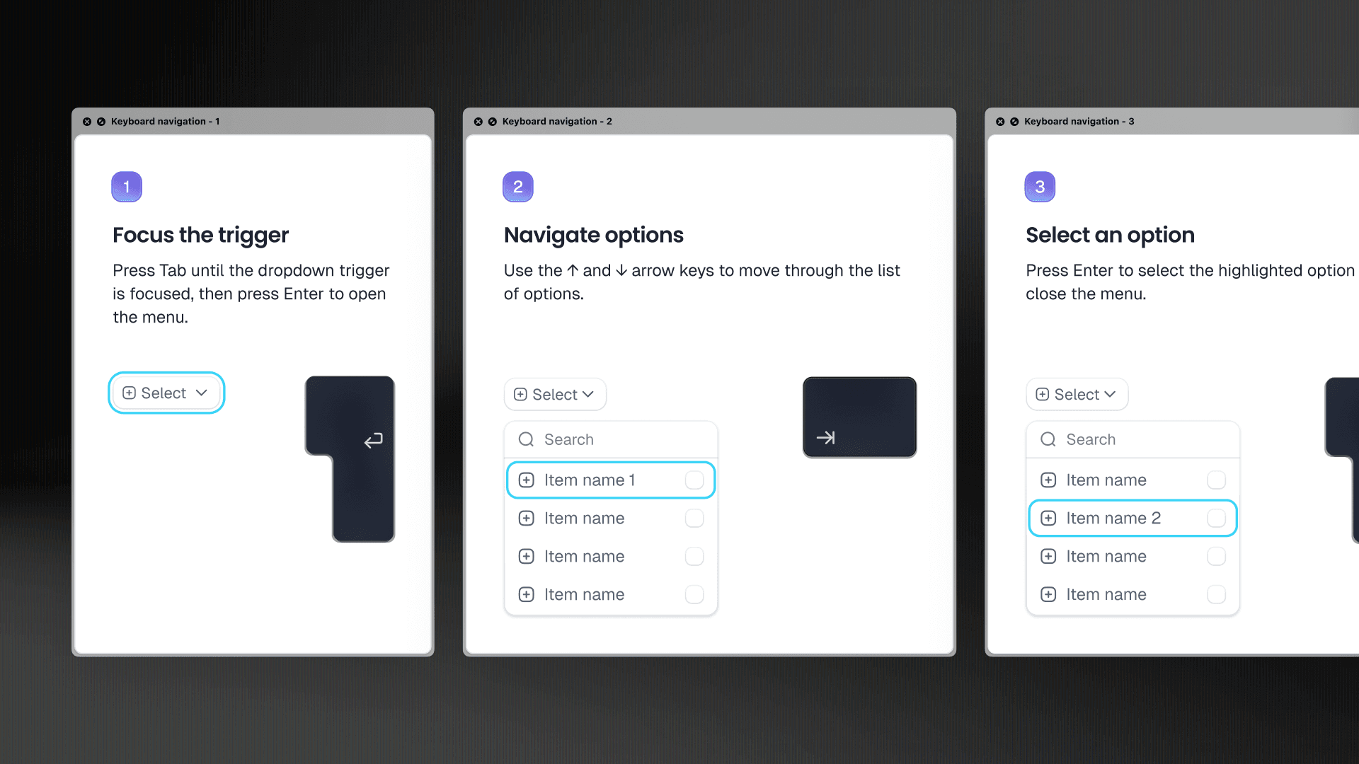
Components that handle keyboard navigation correctly
Documentation that explains behavior, not just visuals
The good news is it’s easier than ever. Figma includes contrast checks in the color picker. You can annotate accessibility expectations directly in your files. Plugins like Able, Contrast, or Order Helper catch issues during design before handoff.
You don’t need a new workflow, just better habits supported by tools you already use.
Start here if you already have a design system
It is not too late to improve accessibility without a full rebuild. Begin by auditing your most-used components such as buttons, inputs, and modals. Check contrast, focus states, labels, and keyboard support.
Fix your color tokens first since color contrast is low-hanging fruit with immediate impact.
Add accessibility notes to your documentation to guide usage, even if components are not perfect yet.
Introduce a focus style standard that is visible, consistent, and not reliant on browser defaults.
Leverage Figma’s contrast checks, annotations, and accessibility plugins.
Don’t wait for a full overhaul. Every time you touch a component, treat it as a chance to improve accessibility. Small improvements add up quickly. Think of it as ongoing maintenance, not a relaunch. Your design system is a living product and accessibility should grow with it.
Designers don’t have to do it alone but they can lead
Most design systems start in design tools where components are shaped, tokens named, and expectations set. Without accessibility considered early, developers are left to guess.
Design teams can lead by
Documenting keyboard and screen reader behaviors
Including labels, alt text, and error states from the start
Collaborating early with developers to test real interactions
It is not about fixing everything immediately but making accessibility visible, expected, and shared across the team.
Conclusion
Accessibility isn’t an add-on. It’s the foundation. Building it in from the start creates a more inclusive, consistent, and maintainable design system. Your team works more efficiently, your users enjoy better experiences, and your design system becomes a true driver of quality.

stéphanie-dorval.jpg
Stéphanie Dorval
Experience Design
Stéphanie combines holistic product understanding with solid design craftsmanship. She plays a key role in working with user flows, documentation, and handover to development.

