The same text style can have three names in one product: one in Figma, one in the code, and one in the conversation between them. Nobody decides this. It just happens, and nobody notices until the names stop matching.
This is how type scales break. Not in one bad decision, but in a translation. The designer remembers a style by where it was used. The developer finds it by what it looks like in the code. Every handoff turns into a small act of interpretation, and every interpretation can be slightly off. One wrong weight is nothing. A hundred of them, across forty screens and three teams, is a product where every page looks almost right. Almost right is the most expensive kind of wrong, because nobody files a bug for it.
Typography tokens exist to end the translation. A token gives one decision one name, and both sides of the handoff can check it. The designer and the developer stop describing the text and start pointing at it.
But pointing only works if the name is anchored. A name that depends on memory, context or habit becomes one more language to translate. A name tied to something both sides can verify holds, screen after screen, release after release.
The question is what that anchor should be. This article proposes an answer, and explains why it works for designers, developers and the agents that now read design systems too.
Atomic decisions, correct composites
First, a definition. In this article, "atomic" has nothing to do with Atomic Design. An atomic decision is a single typographic choice: one font family, one size, one weight, one line-height. Nothing more.
Many discussions frame typography tokens as a choice between two models. Atomic tokens store each property on its own. Composite tokens bundle them into one style. Pick a side, live with the consequences. That framing is wrong. The two are not alternatives, but two steps of the same process.
Atomic decisions come first. They define the raw material of the scale: which sizes exist, which weights are allowed, which family carries the product. Each one is made once, named once, and changed in one place.
Composites come second. They decide which atomic values belong together. A size of 14 with a line-height of 1.5 is a body style. The same size with a line-height of 1.2 is a label. The values are the same raw material. The combination is the decision.
The Design Tokens Community Group specification describes composites in exactly these terms: closely related values that are applied together, with typography as the main example. Each property inside a composite can reference an atomic token instead of repeating a value. That is where the scale becomes maintainable. Change one atomic token, and every composite that uses it updates.

Each model fails when it works alone. Atomic tokens without composites leave every combination open, so nothing stops a heading size from ending up with a body line-height. Composites without atomic tokens repeat the same values in dozens of places, so a single change becomes a search and replace across the system.
Together, they divide the work. Atomic tokens decide what is possible. Composites decide what is correct. That correctness holds only as long as combinations stay intact. Every change to a composite at the point of use weakens it, so the question of who is allowed to make that change matters as much as the composite itself.
What a composite costs in code
In CSS, a typography composite has a natural form: the font shorthand. Weight, size, line-height and family fit into one declaration, and one token can carry all of them.
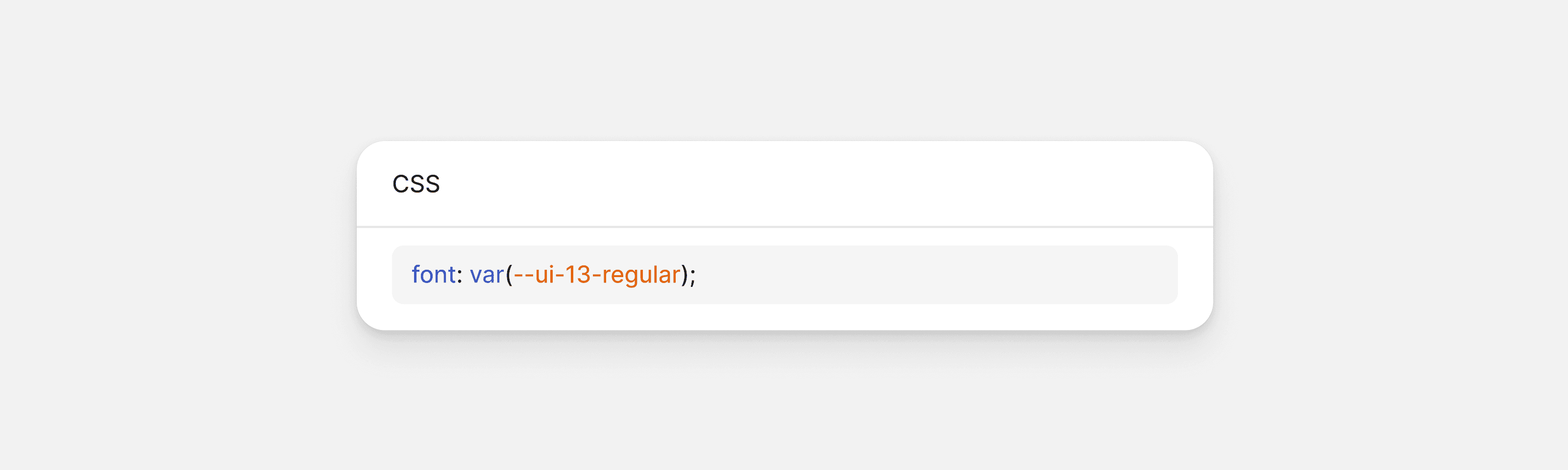
It is clean, and it has a cost that is easy to miss. The shorthand does not only set the properties it contains. It also resets a list of properties it cannot contain, returning them to their default values. That list includes font-feature-settings, font-kerning and font-variant-numeric.
The last one matters most in B2B. font-variant-numeric: tabular-nums gives every digit the same width, so numbers in a column line up. Without it, digits keep their natural widths, and a table of figures starts to drift.
When both rules meet:

The shorthand comes second, so it wins. The tabular figures are gone. No error, no warning. Swap the two lines and everything works again.
That is the real problem. Whether a table aligns depends on the cascade: the order of two lines, the layer a rule sits in, the specificity of a selector. A typographic decision that depends on the cascade is not a decision. It is a coincidence.
A dedicated token for tabular figures does not fix it. It is still a separate declaration, and it still loses whenever the cascade favours the shorthand. The coincidence moves, but it stays.
Dropping the shorthand solves part of it. A utility class can declare font-size, line-height and font-weight one by one, keep the combination together and reset nothing. But a class knows how text looks, not what it shows. It cannot tell a price from a label. The decision to align figures still needs a place that knows the content.
That place is the component. A data cell, a metric or a numeric value declares tabular figures as part of its own styles, once, in the place where numbers are displayed. The component sets its type with individual properties, not the shorthand, so it never resets what it declares itself. The decision is made by the component, not left to whoever writes the next screen.
Numbers in running text stay as they are. In a sentence, proportional figures read better, and tabular ones look spaced out. Body text keeps its defaults, and only data components change them.
Why B2B scales are built differently
Much of the advice on type scales starts with a ratio. Pick a base size, multiply it by 1.25 or 1.333, and repeat until the scale reaches the largest heading. The method is elegant, and it comes from a specific tradition: editorial design, where the job of typography is to guide a reader through a text.
A B2B product has a different job. Nobody reads a settings page from top to bottom. People scan a table for one value, compare two columns, find the field that failed validation. The interface is optimised for scanning, not for reading, and that changes what a scale has to do.
The steps are small near the base. A modular ratio spreads sizes apart, so each level is clearly distinct. In a dense interface, most text sits within a few pixels of the body size: table cells, labels, helper text, menu items. The scale needs fine steps where most of the text lives, not dramatic jumps between headings that appear once per page. With so little room between sizes, hierarchy moves to weight. A medium label and a regular value can sit at the same size and still read as two different levels.
The sizes are fixed. Fluid type, where sizes grow with the viewport, works well for editorial pages. In a product, a table that changes size with the window breaks alignment and density. IBM's Carbon design system draws the line clearly: all headings in its productive type set are fixed, while most headings in its expressive set, built for editorial and marketing pages, are fluid. Fixed does not mean rigid. Sizes set in rem still follow the user's browser settings, so the scale stays fixed relative to the interface, not to the person reading it.
Line-height depends on how the text runs, not on its size. A single line of interface text needs a tight line-height so it aligns with icons and controls. A paragraph of help text at the same size needs more space to stay readable. Same size, different composite. This is the distinction between atomic decisions and composites, applied to the scale.
None of this means fewer rules. It means different ones. An editorial scale is derived from a ratio. A B2B scale is derived from the interface: the densest table, the smallest label, the longest form. The ratio is a starting point at most. The product decides the rest.
Naming: by role or by value
Every typography token needs a name, and there are two ways to give it one. The name can describe what the text does, or it can describe what the text is. Both approaches are used by serious design systems, and both pay a price.
Naming by role describes function: heading-section, paragraph-default, label, caption. The strength is clear. A designer chooses by asking what the text is for, not which size looks right, and that question has a more consistent answer. Values can change without breaking the name: if body text moves from 14 to 15, paragraph-default is still true.
The cost shows up over time. A role name can be used for something it was not meant for. A caption style ends up under a table because it has the right size, and the name now says one thing while the text does another. Roles also multiply. Every new context asks for its own: table-header, sidebar-item, badge-text. The list grows with the product, and teams start debating which role applies instead of designing.
Naming by value describes appearance: ui-14-medium, body-16-regular. The strength is precision. Anyone can read the name and know exactly what it produces. There is nothing to debate, and the list is bounded by the scale, not by the number of contexts.
The cost is meaning. A value name says nothing about where the text belongs, so that knowledge has to live somewhere else. And if a value changes, the name stops being true: ui-14 cannot become 15 without either a rename or a lie.
A middle path exists. Names like body-large or label-small combine a role with a relative size. They keep the function readable, but the size word still breaks when the scale changes: large stops meaning large the moment a larger style is added.
The largest public design systems lean towards role. Material names its styles by use and relative size, such as title-small and label-large. Carbon combines a role with an index, such as label-01 and body-compact-01. Polaris keeps value-like primitives, but exposes role-based variants such as headingMd and bodyMd on top of them. These are not careless choices. They are built for a specific situation: thousands of teams outside the system, composing screens from generic text elements. When nobody else knows what a piece of text is for, the token has to say it. A product team that builds its own components is in a different situation, and that changes where the role can live.
Neither approach is wrong in general. The right choice depends on what the system needs most. For a B2B design system, two criteria matter more than the rest. The first is parity between design and code: whether a name means the same thing, and can be checked, on both sides of the handoff. The second is maintenance: what happens to names, styles and screens when the scale changes. Judged on those two criteria, one approach comes out ahead.
The role lives in the component
On both criteria, naming by value wins. Not because roles do not matter, but because the token is the wrong place to keep them.
A value name has three parts, and all three are values: a prefix, a size and a weight. The prefix sets the line-height. Ui- is tight, built to sit next to icons and controls, while body- is open, built for reading over several lines. ui-14-medium and body-14-medium share a size and a weight, and differ only in spacing.
Neither prefix says what the text is for. Both say how it is set, so both can be checked. Choosing between them is a judgement, like choosing a weight. That judgement belongs to the component.
Start with parity. A designer sees ui-14-medium in a text style. A developer writes ui-14-medium in a stylesheet, and nobody has to interpret anything. A role name can be identical on both sides too, but it is checked differently. A value name is checked against what it produces: either the style is 14 and medium, or it is not. A role name is checked against how it is used, and usage is a judgement. Judgements drift.
But parity is not correctness. A value name proves that Figma and code match. It does not prove that the right style was chosen. ui-14-regular where ui-14-medium belongs matches perfectly on both sides, and is still wrong. No name can prevent that. Only removing the choice can, and that is the component's job.
Then maintenance. The usual objection is that value names lie when values change. They do not, because in a value-named system values are not reassigned. They are replaced. If 14 stops working, ui-14 does not become 15. A new ui-15 is added, the components that need it move to it, and the old token is deprecated, then removed once nothing depends on it. The old name never lies, because it never changes meaning.

Replacement has a cost. When a value used by many components changes, each of them has to be updated. A role name would change in one place. The cost is deliberate. Every component that moves does so because someone decided it should, not because a change somewhere else reached it by accident.
The names also survive brands and densities. A white-label product changes the family, not the size, so ui-14-medium stays true. A compact view picks a different token instead of changing what an existing one means.
That leaves the real cost of value names: they carry no meaning. Something has to know that a style belongs to a label, a table cell or a section heading. In a B2B product, that something already exists. It is the component.
B2B interfaces are built from components. Buttons, inputs, tables, menus, alerts, form fields: nearly every piece of text lives inside one of them. A label component knows it is a label. It applies ui-12-medium once, and every label in the product follows. The designer no longer picks a text style. They pick a component, and the component brings the typographic decision with it.
This kills the main advantage of role names. A role name survives a change of value: update the body style, and paragraph-default is still true. Components give a value-named system the same result. If labels move from 12 to 13, the change happens once, in the label component, and every label follows.
The costs of role names stay, because components do not remove them. They only move them. Whoever builds a table header can still pick caption because the size fits, and now the false claim lives inside a component instead of on a screen. A value name makes no claim, so it cannot become false. And the list of roles keeps growing with every context the product adds.
What survives is the real strength of role naming: designers still choose by function. The difference is where the function lives. A component has behaviour, states and documentation. A token name has none of those things. The role does not disappear. It moves to the place that can hold it.
What an agent reads
Everything above applies to agents, with one difference: an agent has no context to fall back on. A designer knows which style belongs to a label because they have seen it used. An agent only sees names and values.
This section is short on purpose. The tools and formats for describing design systems to agents are young, and they change faster than any article can follow. Any tool named here would be outdated before the article is. The principle behind them will not be: an agent can only follow meaning that is written down.

A value-named token, on its own, gives an agent no meaning to follow. A documented component does. When the role lives in the component, the agent does not need to guess what ui-12-medium is for. It uses the label, and inherits the decision.
The value name gives an agent something else: a way to check its own work. An agent can compare a text style in Figma with a declaration in code and know, without judgement, whether they match. It can find every use of ui-14-medium in a codebase, or flag a component that uses a value outside the scale. A role name does not allow this. To check whether heading-section is used correctly, an agent has to decide what a section heading is, and that is the same judgement that drifts between people.
The two checks split the same way they do for people. The value name lets an agent verify that design and code match. The component makes sure the right value was chosen in the first place. Neither does the other's job.
What to decide first
A typography token system is not built by choosing a scale. It is built by making three decisions, ideally before the first token exists, or before the next refactor.
Which atomic decisions are shared. An atomic token earns its place when more than one composite depends on it. Sizes, weights and families are reused across the scale, so they become tokens. An atomic value used by a single composite gains little from a name of its own. Composites are always named, because they are what components apply. Tokenising everything does not make a system more structured. It makes it heavier.
Where the role lives. In a B2B product, the answer is the component. Tokens describe values, components carry meaning, and prose uses the body- family. Deciding this early changes how every name in the system is written.
Who can override what. Composites protect combinations, and every override weakens that protection. The rule that keeps a system intact is simple: overrides belong to components, not to individual screens. The tabular figures in a data component are an override of this kind. A single table cell on a single page should not change its line-height.
These decisions are the anchor this article started with. A name that points to a value both sides can verify, inside a component that knows what it is for, does not need to be translated. Designers, developers and agents read it the same way.

dario-cardella.jpg
Dario Cardella
Product Design
Dario cuts through noise to find the experience that sets your product apart. He brings brand thinking into product work, which is rare and valuable when your interface is your brand.